ShopDreamUp AI ArtDreamUp

Deviation Actions


Suggested Deviants


Suggested Collections


You Might Like…


![[AT] Panda dream](https://images-wixmp-ed30a86b8c4ca887773594c2.wixmp.com/f/01be9e76-8f47-4643-9bf2-e17a2480d792/ddcagka-77b0c756-89d9-45ba-8a81-3b81ae983f2a.png/v1/crop/w_184,h_184,x_0,y_15,scl_0.15333333333333,q_70,strp/_at__panda_dream_by_isi_chisi_ddcagka-92s-2x.jpg?token=eyJ0eXAiOiJKV1QiLCJhbGciOiJIUzI1NiJ9.eyJzdWIiOiJ1cm46YXBwOjdlMGQxODg5ODIyNjQzNzNhNWYwZDQxNWVhMGQyNmUwIiwiaXNzIjoidXJuOmFwcDo3ZTBkMTg4OTgyMjY0MzczYTVmMGQ0MTVlYTBkMjZlMCIsIm9iaiI6W1t7ImhlaWdodCI6Ijw9MTYwMCIsInBhdGgiOiJcL2ZcLzAxYmU5ZTc2LThmNDctNDY0My05YmYyLWUxN2EyNDgwZDc5MlwvZGRjYWdrYS03N2IwYzc1Ni04OWQ5LTQ1YmEtOGE4MS0zYjgxYWU5ODNmMmEucG5nIiwid2lkdGgiOiI8PTEyMDAifV1dLCJhdWQiOlsidXJuOnNlcnZpY2U6aW1hZ2Uub3BlcmF0aW9ucyJdfQ.QMXuAk8RTuLTvC1ygeMA8kmUQvODGjOtY8Av7_QX_O4)
![[AT] Panda dream](https://images-wixmp-ed30a86b8c4ca887773594c2.wixmp.com/f/01be9e76-8f47-4643-9bf2-e17a2480d792/ddcagka-77b0c756-89d9-45ba-8a81-3b81ae983f2a.png/v1/crop/w_92,h_92,x_0,y_8,scl_0.076666666666667,q_70,strp/_at__panda_dream_by_isi_chisi_ddcagka-92s.jpg?token=eyJ0eXAiOiJKV1QiLCJhbGciOiJIUzI1NiJ9.eyJzdWIiOiJ1cm46YXBwOjdlMGQxODg5ODIyNjQzNzNhNWYwZDQxNWVhMGQyNmUwIiwiaXNzIjoidXJuOmFwcDo3ZTBkMTg4OTgyMjY0MzczYTVmMGQ0MTVlYTBkMjZlMCIsIm9iaiI6W1t7ImhlaWdodCI6Ijw9MTYwMCIsInBhdGgiOiJcL2ZcLzAxYmU5ZTc2LThmNDctNDY0My05YmYyLWUxN2EyNDgwZDc5MlwvZGRjYWdrYS03N2IwYzc1Ni04OWQ5LTQ1YmEtOGE4MS0zYjgxYWU5ODNmMmEucG5nIiwid2lkdGgiOiI8PTEyMDAifV1dLCJhdWQiOlsidXJuOnNlcnZpY2U6aW1hZ2Uub3BlcmF0aW9ucyJdfQ.QMXuAk8RTuLTvC1ygeMA8kmUQvODGjOtY8Av7_QX_O4)


Featured in Groups


Comments10
Join the community to add your comment. Already a deviant? Log In
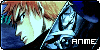
First of all, this is very adorable! I'm gonna write this in sections, starting with what is working and what is really good about this piece!
** The atmosphere and aesthetic is very nice. This is a perfect gift for someone you love uwu There is a very soft, peaceful, calm, and cozy feeling about the way you drew this. The hazy blur effect in combination with the pastel pinks and white along with her gentle smile help to make the viewer feel welcomed and calm.
** You balanced out all the pastels with a heavily saturated purple (and blacks) in a way that really works. It keeps the viewer from being stuck in a spot on the piece, and helps to add interest. The touches of light purple/pink and red so close to the dark purple and black help to connect the dark to the light and keep things harmonious.
** I also appreciate the unique approach to a common scene of an anime catgirl in bed. You made her cute and very genuine and innocent, whereas many who draw similar scenes make it over-sexualized, enticing, and alluring with a big boobed and scantly clad character...NOT that that is a problem, but it's been done over and over again so much, that it's refreshing to see that someone didn't do that for once.
Now, what is not working:
** Anatomy. You have a good grip on it, but there are some little things out of place that can mess a whole drawing up. It's helpful to remember some human body ratio and relation stuff. Like, generally:
- the length of the start of the legs to the knee is about the same as the length of the shoulders to the start of the legs. And the knee to the ankle are also the same length.
- Someone's feet are gonna be the same length as their forearm (so elbow to wrist).
- With realism and MOST semi-realistic cartoons, the shoulders are wide enough to equal the size of 3 of the character's heads. So you should technically be able to draw one more head on each side of a character's shoulders and fit them both---HOWEVER for a heavily stylized art style like MOST ANIME styles, this is not true and the shoulders are often drawn much smaller. It's up to you what you want to do, but as long as you know the shoulders are realistically larger than you've drawn them, it's fine.
- In a similar vein, hands are USUALLY the same size as the face, from chin to eyebrows HOWEVER in anime, since the heads and eyes are enlarged, this isn't true. SO I would guess, the hands should be about the size from the chin to at least the halfway point of the eyes. Since her hands are clinched, it's hard to know how large you really made them, but still, it's good to know.
-And Lastly, the BEST thing to do is to look up references! Stock photos accounts, and whatnot. SenshiStock is a great deviantart user who uploads some wonderful art references. Also groups like Pose-Emporium. No matter what style you draw in, looking at real-life references will actually help MUCH more than looking at other people's art or anime/manga as references when you are doing anatomy (UNLESS you are looking at someone's anatomy studies).
** Weight. I know she is supposed to be laying down on the bed, but it actually looks more like she is standing/floating upright with the background of a bed behind her on a greenscreen or something. The problem is, she seems weightless and doesn't seem to be making a natural indent in the bed. I know this viewpoint of the viewer looking from straight about the character on the bed is VERY common, but it doesn't do any favors because it makes it harder to draw the character putting weight on the bed. Some ways to fix this:
- Look up references! I'll keep saying this lol But it's true. Google "girl laying in bed" or search here on deviantart. Find photos of people in bed and study how the covers fluff up around the person and parts of the covers will even cover parts of the body.
- Add shading/lighting. I know you have some on the character's body already, and some on the covers, but, she doesn't have a shadow! Well.. she has a very faint one, but for this particular scene, it might help more to have some darker shading in the covers and especially where the covers fluff around her body (ie, her calves, feet, butt/back, shoulders...). The same thing goes for the pillows fluffing around her head.
- Her skirt in particular make it feel like she is floating upright or this is a freeze-frame image of her about to jump high into the air. You did the folds pretty well..the only problem is they aren't laying back as if she is laying down. This is because you drew the underside/inside of the skirt at the bottom. On the part where her legs are crossing, it looks good, but on the sides it doesn't work. If you make the top hem/edge of the skirt longer and do away with the inside part (only on the sides) then it would help push the idea that she is laying down.
Over all, this is a very cute and well made drawing that caught my attention for the colors and just how genuinely adorable it is. Your drip on color theory is pretty good (whether because of natural instinct, classes or both), and your boyfriend should be proud of this! (and you too) uwu